ShopDreamUp AI ArtDreamUp

Deviation Actions


Description
this ones for 
ahh, finally finished another one, sorry for the delay")
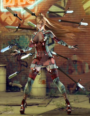
this ones a commission of his character DRAGON EYS NATSUME,
her good side and bad side fighting
i thought i wont be able to finish this one when i saw the character reference i was like "holy heck!" and took me like forever sketching their poses
and now im finally done with it
i also got to do a Livestream doing this one
invited some friends and my to watch some of the process i did in finalizing this one
over all, i had a good time, inspired i guess
any wayz, hope you guys like this one.
drawn and painted on Paint Tool SAI and added effects and edited on Adobe Photoshop.
line art
colors
ahh, finally finished another one, sorry for the delay
this ones a commission of his character DRAGON EYS NATSUME,
her good side and bad side fighting
i thought i wont be able to finish this one when i saw the character reference i was like "holy heck!" and took me like forever sketching their poses
and now im finally done with it
i also got to do a Livestream doing this one
invited some friends and my
over all, i had a good time, inspired i guess
any wayz, hope you guys like this one.
drawn and painted on Paint Tool SAI and added effects and edited on Adobe Photoshop.
line art
colors
Image size
3300x5100px 5.77 MB
© 2009 - 2024 totmoartsstudio2
Comments70
Join the community to add your comment. Already a deviant? Log In
Nice work. There are a few details I'd like to point out though.
The defending character's not planted firmly on the ground. To defend against an overhead attack like that, she should have both feet planted firmly. The left foot is ok, but her right foot is not on the same plane as her left one. Her body posture is also twisting rather than standing firm against the attack. She should be bracing herself more for that impact. Also, proper katana grips have the middle knuckles of the hands lined up perfectly straight with the blade of the katana itself. Your defender's grip is off-center there.
The attacker's positioning could be more dynamic. The blade doesn't look like it's slashing downward; it should be more horizontal and well... come close to cleaving the defender's head. Here though, she doesn't look like she was aiming for the defender at all; if you follow the path of the attacker's blade the blade would have missed the defender entirely. Now, leaping attacks are used because they (should) have greater power than a normal attack; in a leaping downward strike, the attacker (should) be using the momentum of the descent to increase the strength of her attack. Often times, they use two hands for the attack. But here, you have her swing her sword with one hand, so it's weaker. It's like she's not really committed to her attack and well, it kinds implies she's being lazy. The cape doesn't reflect her movement either; assuming she's falling downward into her attack, her cape should be going from lower left to upper right, starting from her shoulders
Composition wise, I think if you're going to emphasize the "fight within", the dramatic focus of the piece should be the interaction between the characters; the characters should be looking straight into each other's eyes, and that there, would build tension and drama between the two. These two characters however are looking in different directions and that takes away intensity.
You've got alot of light effects there and that takes away from the impact as well. The drama of a clash in a fight scene should come from the characters involved, and not the lighting effects. Here though, the viewer's eyes are drawn to the clashing point of the swords rather than to the characters themselves. In addition, both characters have costumes with cool coloring. The background has a cool tone as well. There's no contrast between the background and the characters, so the characters don't pop. The piece ends up feeling flatter and less dynamic than it should be.